Analytics
Analytics is the workspace-wide reporting surface in Ithura. It shows how work is composed, how it flows over time, and how individual projects are performing. The former separate Insights views are folded in here as tabs.
Analytics reads across every project you can see in the workspace; it does not change any data.
Where it lives
- Route:
/{workspace}/analytics(the "Analytics" item in the workspace sidebar). - The old
/{workspace}/insightspath still resolves: it redirects to/{workspace}/analyticsso existing bookmarks keep working. - Analytics is a Pro-plan feature. On a lower plan the page is gated and prompts to upgrade.
What it does
Analytics has three tabs across the top:
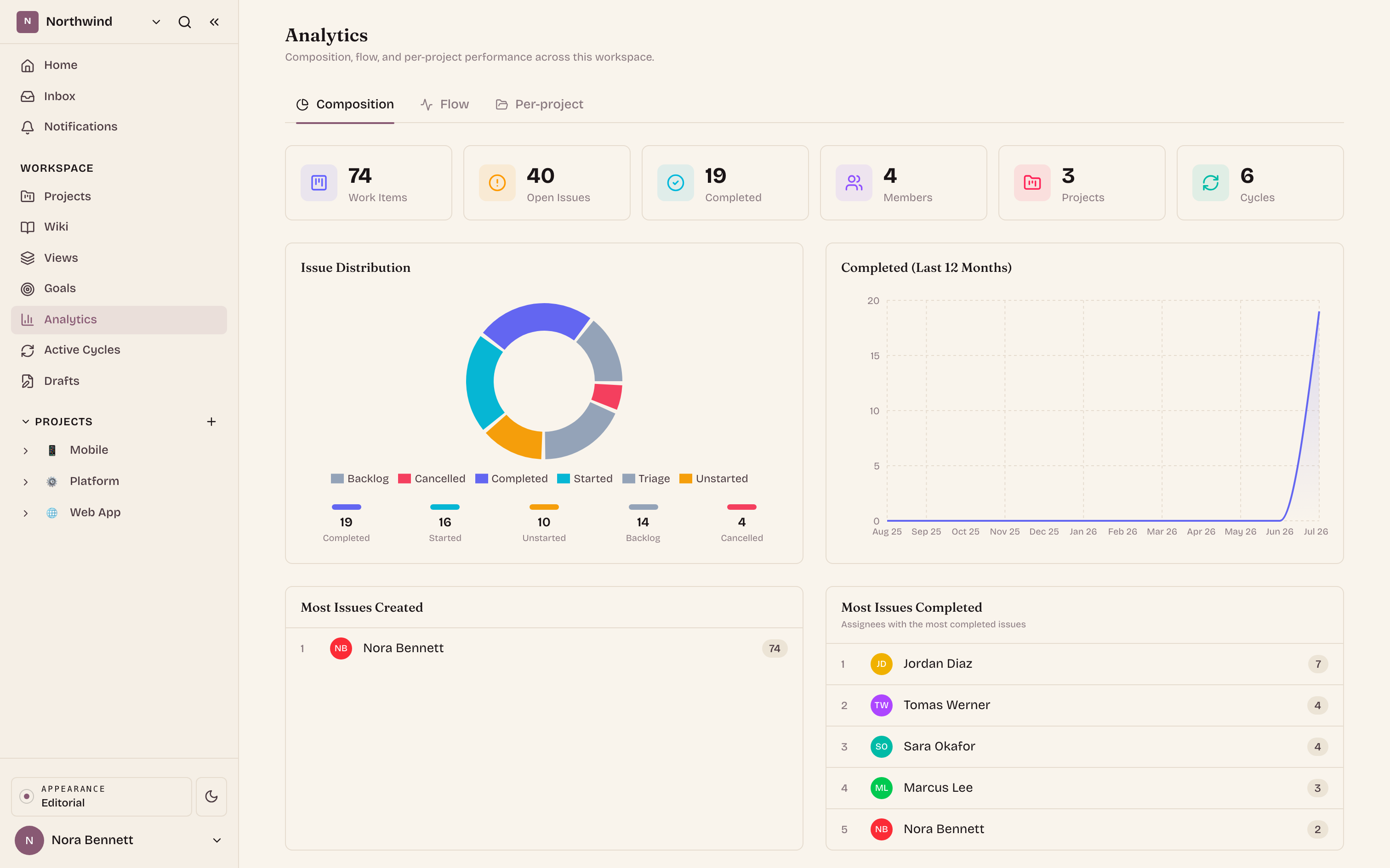
Composition
The default tab. It answers "what does the work look like right now".
- Overview stat cards: Work Items, Open Issues, Completed, Members, Projects, Cycles.
- Issue Distribution: a donut of issues by state group (completed, started, unstarted, backlog, cancelled) with per-group counts.
- Completed (Last 12 Months): an area chart of completion volume month by month.
- Top contributors: "Most Issues Created" and "Most Issues Completed" leader lists (shown only when there is data).
- Custom Analysis: pick a dimension to group issue counts by, then read the result as a bar chart plus a data table. Available dimensions are State Group, Priority, Label, Assignee, Project, State, Sprint, Module, Created Date, Completed Date, Start Date, and Target Date. You can scope the analysis to All projects or a single project. The table under the chart lists each dimension value with its exact issue count.
- Issues by Project: a horizontal stacked bar per project, split by state group (Completed, Started, Unstarted, Backlog, Cancelled), so you can compare the size and health of projects side by side.
Flow
Throughput and timing across the workspace, over the last 30 days.
- KPI row: Open issues, In progress, and Completed in the period.
- Completion throughput (last 30 days): an area chart of issues completed per day, so you can see the workspace's delivery rate and its peaks and lulls.
- Distribution: "By state" (donut, by state group) and "By priority" (bar).
- Top assignees: the members carrying the most issues.
- Cycle time and Lead time, each shown as p50 and p90. Cycle time measures from the first move into an in-progress state to completion (how long active work took). Lead time measures from creation to completion (the full wait a requester experiences). p50 is the typical case, p90 is the slow tail: a wide gap between them means your timings are inconsistent.
Per-project
Pick one project from the picker (it defaults to your first project) to see six project-level charts. These are the detailed delivery views that used to live on the separate Insights page.
- Burndown: remaining work per day plotted against an ideal straight-line descent. A line above the ideal means the project is behind; below means ahead. Without a cycle scope it covers the last 30 days.
- Velocity (last 6 cycles): committed story points versus completed story points per cycle, so you can see how much each cycle planned and how much it actually finished. Use it to set realistic commitments for the next cycle.
- Cumulative flow: a stacked area of how many issues sat in each state group (backlog, unstarted, started, completed, cancelled, triage) on each day. Widening bands signal a bottleneck, a steadily growing completed band signals healthy flow.
- Throughput by epic: completed issues over time (default last 30 days), stacked per epic, ranked by total completed. Issues whose parent is not an epic, or that have no parent, are grouped under "(no epic)", so the chart accounts for all completed work.
- Cycle-time distribution: a histogram that buckets each completed issue's cycle time into fixed bands (under 1h, 1 to 4h, 4 to 24h, 1 to 3d, 3 to 7d, 1 to 2w, 2 to 4w, over 4w), with p50, p90, and average summarised below it. A right-lean means work tends to sit before it closes.
- Custom field aggregation: pick any custom field defined on the project. Number fields report count, sum, average, and p50 / p90. Text, select, boolean, date, and URL fields render a bar chart of counts per value. This is how you slice delivery by fields that are specific to your team.
How to use it
- Open Analytics from the workspace sidebar.
- Start on Composition for the current-state picture, switch to Flow for trends and timing, or Per-project to drill into one project.
- In Composition, use the Custom Analysis dimension and project pickers to slice issue counts the way you need, then read the table below the chart for exact numbers.
- In Per-project, change the project in the picker to compare projects, and use the Custom field aggregation field picker to switch which custom field is summarised.
Every view is read-only: Analytics reflects your live data but never edits it, so you can slice and compare freely.
Empty states
- No projects in the workspace: Analytics shows a "No project" panel with a Create a project button instead of zeroed cards, because there is nothing to report on yet.
- A chart with no matching data shows a small "No data" placeholder rather than an empty axis. The custom analysis shows "No data available for the selected filters" when your dimension and project combination returns nothing.
Troubleshooting
- Analytics item is missing from the sidebar: the feature is Pro-gated and only appears when the workspace plan and your role allow it.
- Cards read zero but you have work: confirm you are in the right workspace and that the projects holding that work are ones you can see. Analytics only counts issues in projects visible to you.
- A contributor or trend looks stale: charts read live data on load. Reload the page to refetch.
- Custom Analysis shows nothing: widen the scope (switch the project picker back to All projects) or pick a dimension that your issues actually carry (for example, issues that are in no sprint contribute nothing to a Sprint grouping).
- A per-project chart says there is not enough data: Velocity needs cycles with start and end dates, Throughput by epic and Cycle-time distribution need issues completed in the window, and Custom field aggregation needs a custom field defined on the project with values set. Add the missing inputs and the chart fills in.