A shared whiteboard has one job: feel like everyone is standing at the same wall. If cursors lag, if a drag stutters, if a comment lives in a side channel instead of on the sticky it is about, the room splits back into individuals. This release is about closing that distance. Boards got faster hands, better arrows, real comment threads, and a presentation mode worth ending a workshop on.
Everyone on the board, at once
Open a board and you are in the room. Everyone else on it shows up in a presence roster in the header and as a named, colour-coded live cursor on the canvas, and the colour always travels with the name so presence never rests on colour alone. Every edit syncs the moment it happens: drag a sticky and it moves under your teammate's cursor mid-drag, retype a label and the letters appear as you go, change a shape's colour and it changes for the whole room.
Drawing that feels drawn
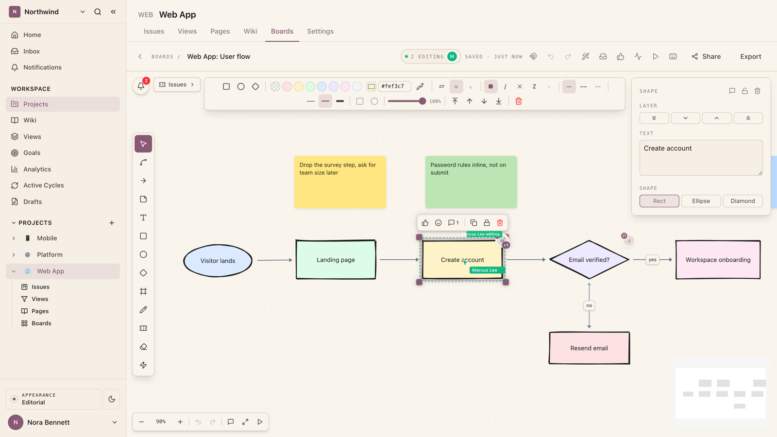
Diagrams read differently when the lines look sketched. Every shape on a board has a sloppiness setting with three levels: Architect for crisp, exact lines, Artist for a light hand-drawn waver (the default), and Cartoonist for a heavy double-pass sketch. Alongside it sits a full style rail: five fill styles (solid, hachure, cross-hatch, zigzag, dots), solid, dashed, or dotted strokes, stroke width, opacity, and corner rounding.
The same rectangle, redrawn live. Switch the sloppiness level and the fill style to feel the range, from architect-exact to marker sketch.
Artist. A light hand-drawn waver, the default. Enough character to feel sketched, not enough to look messy.
Colour got the same attention. The picker takes a typed HEX value and has an eyedropper, so you can sample a colour straight off anything on screen. And when a sticky or shape is selected, the top letter row of the keyboard, Q through P, picks the matching palette swatch. Recolouring a wall of stickies stops being a click-per-note chore and becomes touch typing.
Arrows that behave
Arrows are where most canvas tools quietly fail. Ours got rebuilt around how they are actually used.
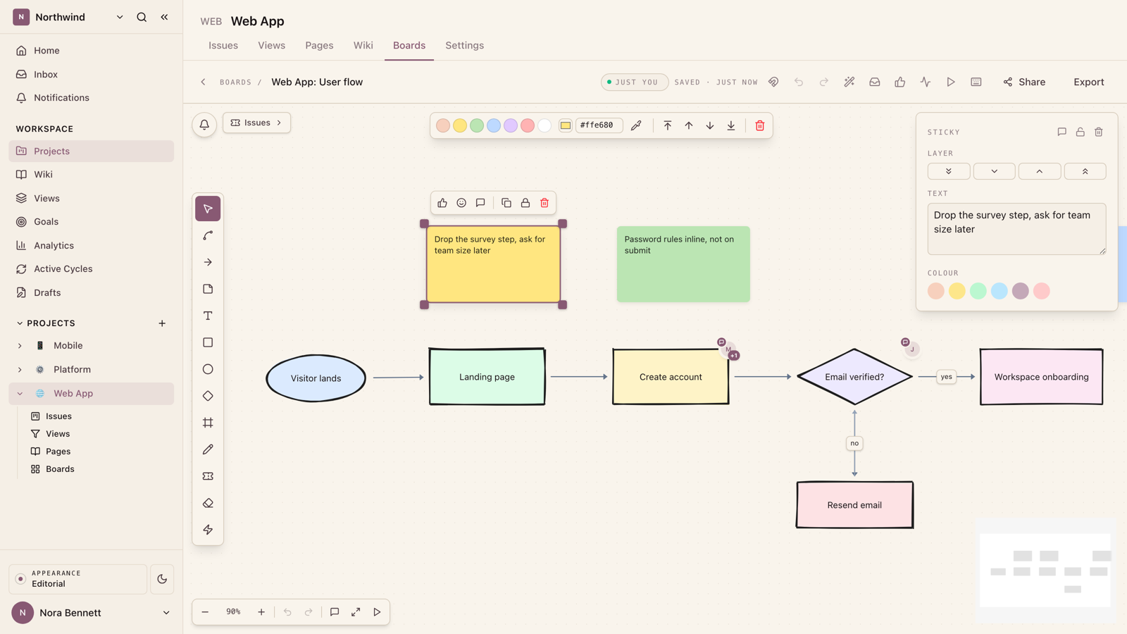
- Floating ends. An arrow between two nodes attaches to the elements, not to fixed points. Move either node and both endpoints slide along the borders to keep the shortest clean line, with a few pixels of breathing room so the arrowhead never squashes into the shape it points at.
- Arrow-first selection. Arrows are thin, so clicking near one selects it. The click acts like a magnet for the edge instead of falling through to the node behind it, which is what you meant almost every time.
- Re-route by grab dot. Select an arrow and each end grows a grab dot. Drag a dot onto a different node and the arrow re-routes there; drop it on empty canvas and that end becomes a free point.
- Standalone arrows are first-class. An arrow that connects nothing can be dragged by its body like any other element, so annotating with loose arrows works the way a marker does.
Comments where the work is
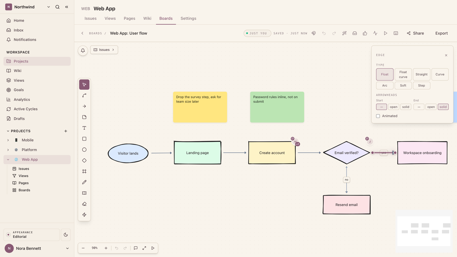
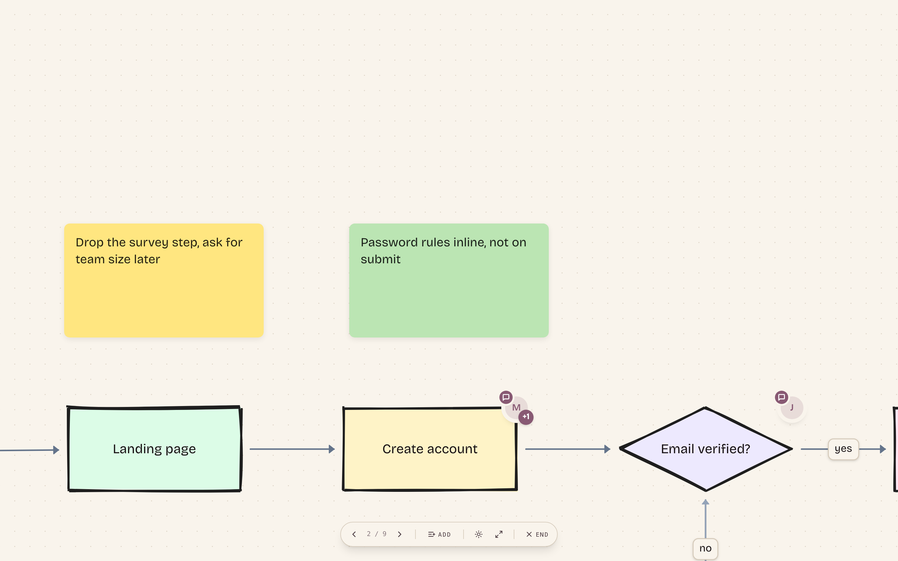
Feedback about a sticky belongs on the sticky. Any element on a board can carry a comment thread, anchored to the node and opened as a popover right where the work is. Threads support @mentions that notify the person named, emoji reactions, and a resolve toggle for when the point is settled. Every comment has a permalink: copy it, send it, and the recipient lands on the board with the camera on that node and the thread open.
Emma
@Marcus can we lose the survey step entirely?
Marcus
Yes. Folding it into the last screen, will update the flow today.
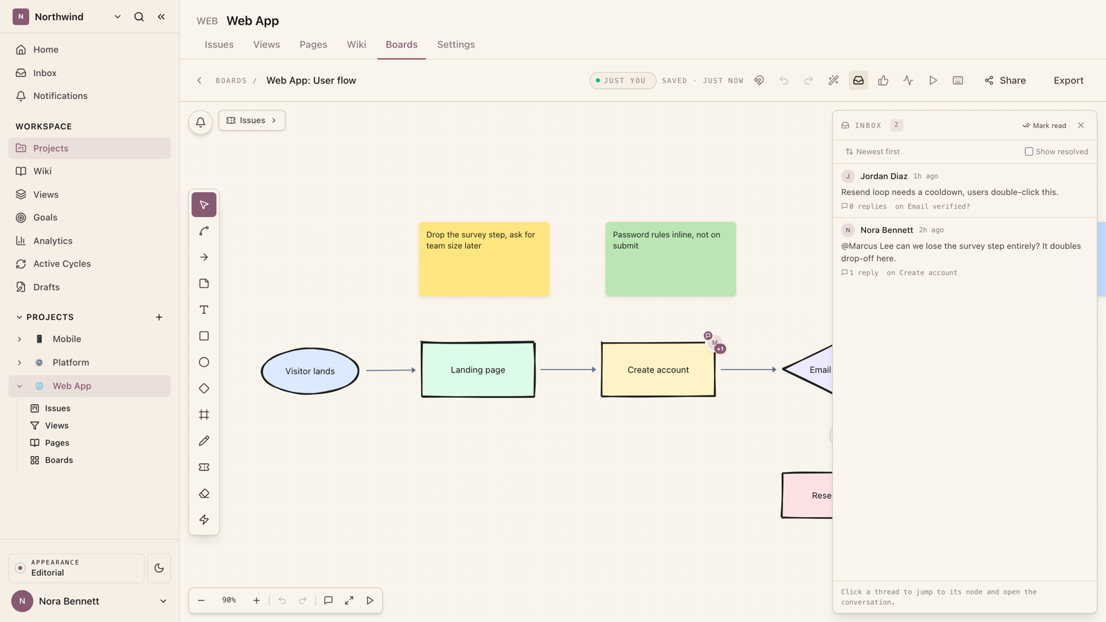
For catching up, the board has a comments inbox: every thread on the board in one list, with a toggle to include resolved ones. Click any entry and the canvas jumps to the node and opens the thread. Reviewing a board someone else annotated overnight takes a minute, not a hunt.
Organize it, then present it
As boards multiply, structure keeps them findable. Group boards into collections, each with its own emoji, and start new boards from a template picker instead of a blank canvas. The workspace home now opens with a boards section too: the boards you recently edited and recently visited, one click away, with ⌘K or ⌘P opening quick search from anywhere.
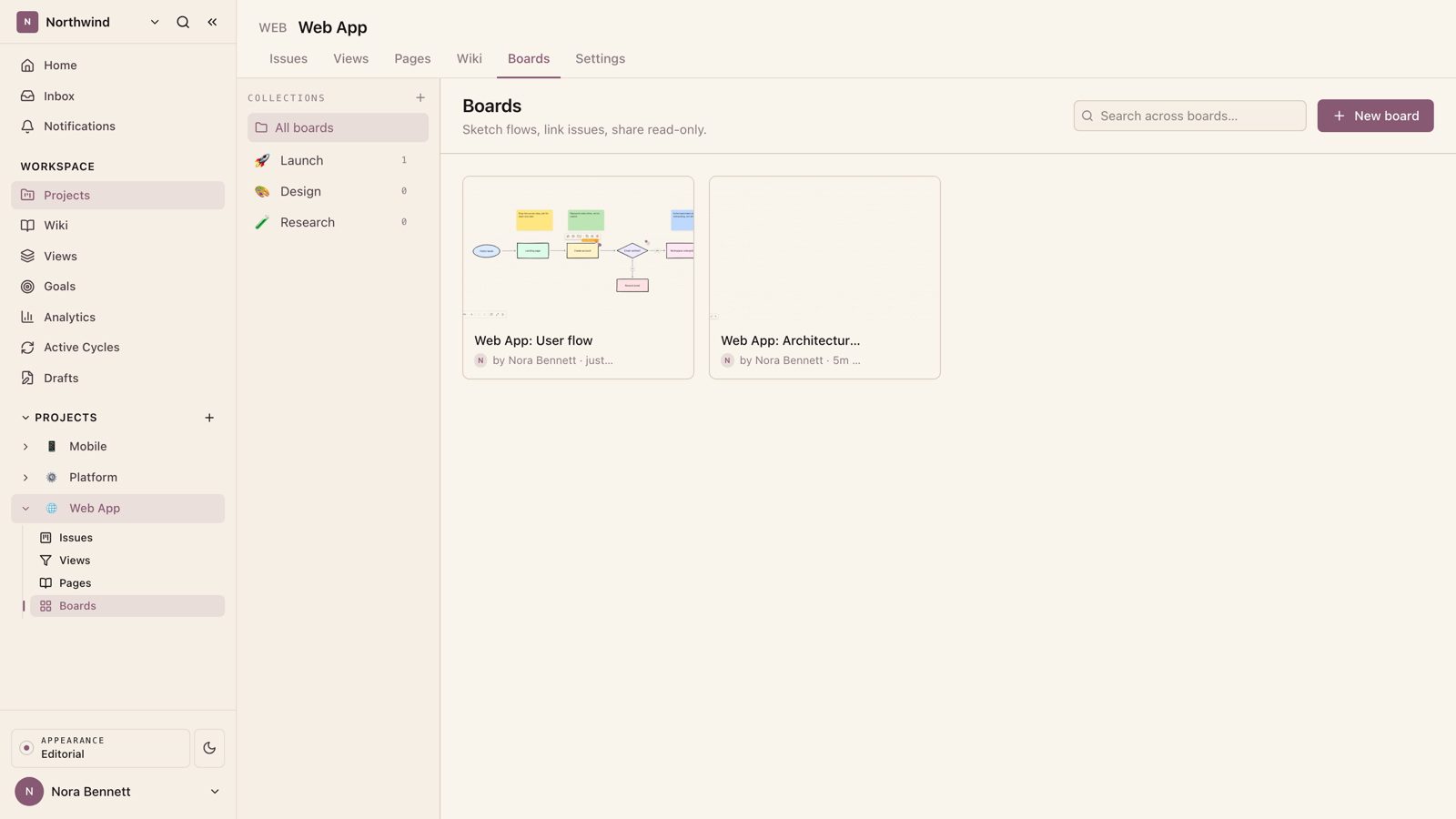
When the thinking is done, the board presents itself. Presentation mode walks the canvas one frame at a time:
Curate the slide order
Pick the exact sequence of stops, or let the board present in reading order, top to bottom and left to right. The camera glides between slides; arrow keys step through.Flip to dark mode and go fullscreen
A dark-mode toggle and a fullscreen switch live in the presentation controls, so the board looks right on a projector without touching your app settings.Hand the result to anyone
Export the canvas to PNG for a doc or a deck, or publish a read-only public link that anyone can open without an account.
Why it works
Each of these is small on its own: a cursor with a name on it, an arrow that keeps a polite gap, a thread pinned to a sticky, a keyboard row that recolours. Together they change what a board session feels like. Nobody waits, nothing gets lost on a refresh, feedback sits on the thing it is about, and the same canvas that held the messy thinking presents the finished version. The whiteboard keeps up, so the team never has to slow down for it.